Cover Photos
When talking about a magazine's cover, the main image has to be the shining star of the cover. From fashion magazines to cooking magazines, the subject of the main cover has to be eye-catching. Having a unique main image placed on the front cover is critical to designing the perfect and most unique cover. You need to assure that the main image is relevant to the genre and professional and modern looking. Ultimately, the main image of the cover plays a huge role into producing the perfect final design.
For my main images, I chose three pictures of a model posing since it is the most relevant image to the fashion genre. This allows me to stick to the usual conventions of a fashion magazine cover. To edit the images, I used Canva for most of the steps in order to create the most unique and eye-catching final main image. However, I also used Picart as it has some unique features that help with the editing. Let's walk through all the steps!
Image 1:
Firstly, I took this photo in natural lighting and a basic setting. It aligns very well with the fashion genre as it features a model posing with a very neutral facial expression. The picture needed some editing as well as a background change or removal. The lighting needed to be brighter as well as some changes in the saturation of the image's colors. From there, I was able to have a main idea of what to change in the editing steps and got to work with it. I went ahead and opened the Canva app.
Next, I uploaded my image and clicked "edit image" from the "Create Design" button. After uploading the image, I chose to increase the brightness by 5 and saturation by 15. Increasing the brightness of the photo helps it be brighter and lively against the background later on in the cover. Increasing the saturation, on the other hand, can make the colors brighter and more colorful and poppy. I decided to stop at that for the image's editing.
Then, I went to the Picart app and uploaded the edited image there. I used the "Tools" button on the menu below the picture and chose "Remove". This tool allows you to remove any unwanted details or things in an image. I set the size of the eraser tool to 50 and erased the black line behind the model. It was very distracting and out of place. After removing it, the image looked way more professional, and the background looked cleaner and sleeker. I then clicked "Next" and saved the image to my files for it to be ready to be used in the final magazine cover.
I thought about changing the whole background by cutting the model and placing the sticker on a different background. However, I closely analyzed the current background and found that it complimented the colors of the image very well and therefore would not need to be replaced. The background was then kept the same as it is with the edits made on Canva.
As a result, I ended up with the image that is shown on the right. It is very simple yet very elegant and matches with the fashion genre very well. The final photo looks very lively, and the model and her pose/expression allow for it to be cover-ready.
Image 2:
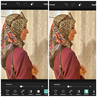
For the second image, I already assured that the lighting was good before capturing it so that the editing process will be easier. I did that by increasing the brightness to 0.7 on an iPhone camera in the menu bar. From there, I was able to capture the image. I thought that all the details of the model's outfit could be expressed with a side, mid shot. For this picture though, I only used the Picsart app to edit it. It did not need as much editing as the last one. However, the temperature of the photo was too warm. That basically means that it is very orange looking as if it was taken next to a fireplace. In order to make the temperature cooler, I used the tools bar in the app again and clicked "Adjust". This took me to a new menu bar that has "Temp" as an option. I decreased it to -10 to make it cooler. Then, I put the highlight of the image down by 15 points. I felt like that made the shadow less harsh and the overall highlights softer. On the left, you can see the way it would look on the app.
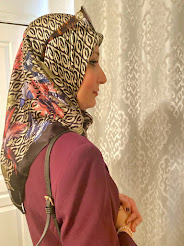
Overall, the image as a whole did not need too much editing and I also chose to keep it very simple as the pose and colors that are in it are already pretty eye-catching. Therefore, I ended up with the image that you can see on the right side here which I am very happy with. It is very aligning with fashion genre and has a unique look to it. The colors complement each other making it look nice and elegant.
Image 3:
For the third and final main image, I chose a different type of image that breaks multiple conventions of fashion magazine models. The image is a long shot of a model that is also against a nature background rather than the usual photoshoot backdrop. The image is very natural and simple compared to the bold magazine images that you usually see. However, since the picture was captured outside, the lighting needs some editing to make the model brighter against the backdrop. So, for this image, I used Picsart throughout the whole editing process since it provides you with more options and tools compared to other softwares.
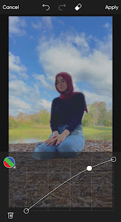
From there, I went to the "Tools" option to start fixing up the colors and lighting. I chose to decrease the contrast to -45 because when looking at the image, I realized that the model is very dark against the background since the light is coming from behind her. This allowed for the colors to contrast and match up better. Then, I put the highlights down to -30 to soften the harsh colors and make them complement each other better. This editing process still needed some more work, so I decided to use the color wheel. The RGB feature on this software allows you to curve the colors up or down in order to make them complement each other better. I curved the line up to make the colors brighter and allow the model to contrast the background. By doing that, it also made the colors appear way less harsh and softened up the sharp difference between the subject and sky.
I debated removing the whole background and putting the sticker against a different solid-colored backdrop so that it contrasts better. However, that would not work as the model just looks like she belons with the current background making it very natural looking. Therefore, I decided not to change it and just stick to the basic editing. As you can see on the right, the final image produced after editing all the elements above is way brighter and has softer colors that go together very well. The overall process allowed for a very natural looking result. While this photo does not follow all fashion magazine codes and conventions, it is still very unique and sophisticated. As a result, the final product has an eye-catching pop to it that can easily attract the eyes of a browser with its uniqueness.
Conclusion:
In conclusion and to sum up my findings, the three images I chose allowed me to realize the power of editing when it comes to magazines and their images. I was also able to experiment with many features and tools on different softwares that allowed me to come up with the final products. The first two images follow the usual fashion cover conventions, however, the third one challenges them in many ways from the pose to the background. I find that the brightness feature was most successful when editing the images and the background remover was the least successful since the natural backgrounds contrast the photos way better. Ultimately, the images did not need as much editing but ended up coming out very modern and clean looking for a magazine cover. They each have an elegant look to them as well as a unique combination of elements.


OMG MAIAR THIS IS SO AMAZING-layla
ReplyDelete